Conditional and unified forms
Achieved goal: a refreshed design for all forms on Axis.com, that is in line with the corporate graphical guidelines and is introducing conditional form fields for a better ease of use. Also, connections to an outdated sales/CRM system were removed.
The updated form logic and design is used throughout the company's many internal and external platforms and interfaces.

Based on the answer to "What brings you here?", the user gets asked more, but only relevant questions.

The options should be clear so it's easy to pick. That is often harder to achieve than first imagined.

Ideally, the error messsage is written specifically for the form field in question, as above.
Based on the answer to "What brings you here?", the user gets asked more, but only relevant questions.
My role: UX Designer. My task was to analyze current data, do competitor analysis, user testing and prototyping.
I started with gathering data from heatmaps, web analytics and interviews with stakeholders. Subsequently I did market research on forms and best practises, followed by prototyping and creating the UI design.
Most importantly, I pushed for the right decisions to be made, based on the collected data we had. I am happy that we changed direction from initial assumptions, and could truly focus on the user experience being as easy and effortless as possible.

The heatmap showed that many visitors did not use the form on the page
Instead they clicked on "Contact form" at the bottom of the page, after scrolling right past it.
Some changes to emphasize the form were definitely needed.
Web statistics
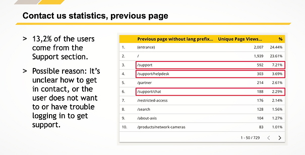
The statistics revealed that users often came from the Support section of the site, and many also continued to Support after visiting the Contact us page.
Additionally, the received leads showed that a significant number of people got in touch due to technical issues. This led to the decision to add "I want support" as an option in the contact form.
Where do the users come from, and go next?
In this case it turned out that the users often came from, and also went forward, to the same page. Going in circles. Usually not a good sign...
Reflections
If I would revamp the forms again now, I would not use uppercase text for the form fields. It followed the graphical guidelines we had, but since it also reduces readability I would avoid it.
This project was quite fast and small, but it is a good example of when data improved the outcome and the results could be clearly measured with heatmaps and statistics.
My sketches: Forms (prototype)